ST5056 Interactive Web Design CA02

Although visual appeal is subjective, there are several principles that I look for in a website.
Firstly, there must be repetition or design flow, which means visual components are repeated throughout the website.
Secondly, there must be contrast between page elements so as to add visual excitement and attract the visitors.
Thirdly, principle of proximity must be applied so that related items are placed close to one another.
Lastly, a cohesive website needs alignment so as to create visual unity.
Based on the 4 design principles, all websites reviewed are “visually appealing” as repetition, contrast, proximity and proper alignment are evident.
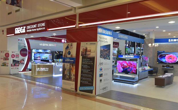
If I would have to pick a winner, personally, I like the one from Mega Discount Store. It has this extra element of merrymaking and vibrancy that makes me want to visit their store or place an order with them. Websites from Parisilk and Best Denki are not far behind too.
However, I find the website of Lucky Store lacklustre and uninspiring. It is clean and decent but somehow, it does not create excitement and I think I miss its definitive call to action.
Related: Going All Out To Woo The Customers

Must Read
Purpose: Going All Out to Woo the Customer
Lim Eng Cheong - Jul 2017
The secret to success is constancy to purpose. Web developers should never lose sight of the main function...


